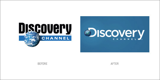
 Discovery Channel finally decided to change their old and weird looking globe logo. Comes with a new tag line too ''the world is just awesome''. I like the style of the new typo, it give such a modern, futuristic look. But the R and Y like got something not right there, don't know how to explain. The new Globe also looks better, but i dont really fancy the globe being place there though, off center don't work for me. just my 1cent. Now that the place the globe together with the D, i guess they can just use the D for branding. rite?
haha..but Yellow Box still rocks for me
1 year ago


0 *inspire me*:
Post a Comment